
Brand Guidelines
Download Brand Standards Manual

One Brand.
One Community.
One Fleming.
Dedicated to student success. Committed to our communities. Powered by exceptional people. Fleming will grow, in unity, to build and create a prosperous future for all.
The Fleming brand has been developed to share our message of growth, unity and creativity.
A visual identity is created with great care, taking into consideration competitive brand positioning, brand personality and character, brand voice, colour palette, imagery style, font family and layout. When these brand elements are used consistently across all touch points, it reflects the integrity of the organization, the importance of its marketing and communications initiatives and builds brand equity. A strong brand enhances an organization’s reputation and is critical to long-term success.
This visual identity and brand standards manual outlines specific guidelines on how to implement Fleming’s brand to maintain consistency across all marketing, recruitment and communications tactics. By using this guide, the materials you create will help carry a consistent message for Fleming.
These guidelines have been prepared for anyone who creates Fleming marketing and communications materials, and/or represents/speaks on the College’s behalf. This manual outlines the proper usage of the visual identity for logo usage, typography, stationery, marketing materials, promotional materials, and more.
If you have any questions about the new brand standards or are unsure about what changes have been made, contact marketingsupport@flemingcollege.ca.
Creating a strong and relevant visual image depends on clear and consistent articulation of our brand and culture, which is expressed primarily through a vocabulary of visual elements and language. It is the combination of all these elements that builds and projects the tangible image and character of Fleming.
Our visual identity is a complete language that, when expressed consistently over time, communicates our values and attitude, establishes our voice and builds an emotional connection with our audiences.
A wordmark confidently displays the Fleming name in a bold, timeless Gotham font. Clean, simple lines and considerable weight result in a highly legible wordmark, applicable across various mediums.
A new shield icon is a contemporary representation of a traditional symbol of higher education. Communicating stability, protection and longevity, the shield brings together elements to reflect the rich heritage of Fleming College.
The lines within the shield form the veins of a leaf, symbolizing sustainability and the natural surroundings of the College campuses, acknowledging that the College is respectfully situated on Michi Saagiig lands and the traditional territory covered by the Williams Treaties. In the largest portion of the shield, the lines come together showcasing a large “F”.
The rich colours in the shield bring together the lasting legacy of Fleming’s campuses and programs in Peterborough, Lindsay, and Haliburton, while conveying a sense of the natural beauty found at Fleming’s campuses.
The combination of heritage and community in a contemporary brand illustrates Fleming’s commitment to providing the foundation for student and community growth.
Fleming College is dedicated to fostering an inclusive and diverse environment. This includes ensuring all our documents comply with AODA guidelines.
General guidelines
- Contrast: Ensure at least a 70% difference in colour value between, say, type and a background tone.
- Type Size: Make text large, preferably between 12 and 18 points.
- Type Style: Choose “Sans-Serif” fonts such as Calibri. These fonts have easily recognizable upper, lower-case and numerical characters. Narrow versions of these fonts should be avoided. Avoid all caps in extended text.
- Alignment: Aligning text to the left margin makes it easier to find the start of the next line and keeps spacing between the words even.
- Hierarchy: Ensure strong hierarchy by creating strong contrasts between headlines and paragraphs.
- Clarity: Do not provide too much information. Use bullet point summaries, rather than dense text.
- Organization:
- Do not place text over cluttered backgrounds.
- Set adequate margins (minimum 0.5 inches).
- Use larger line spacing.
- Leave larger spaces between sections than between paragraphs.
- Readability: Printed material should have a matte finish, not glossy.
For more information on accessibility, visit: Accessibility at Fleming College page
Brand Ambassador Toolkit
The Fleming Social Media Toolkit is here to help employees share their Fleming experiences and celebrate the college’s programs, events, and initiatives on their personal social media accounts.
Sharing Fleming content is designed to be quick, simple, and flexible. Each school folder includes ready-to-use images, suggested captions, and program links to help you create a polished post in just a few minutes.
To create your post:
- Go to Toolkit and open your school folder.
- Open the Caption document and copy a caption related to the program you want to promote.
- Choose a related image from the Image folder.
- Paste the caption and image into your social media platform of choice.
- Add your own voice.
- Tag Fleming College and share.
Logos and Colours

Main Fleming Logo
- Full Colour for Dark Backgrounds
Web (PNG, RGB)
Print (EPS, CMYK) - Full Colour for Light Backgrounds
Web (PNG, RGB)
Print (EPS, CMYK) - White Wordmark for Dark Backgrounds
Print (EPS, CMYK) - Black Wordmark for Light Backgrounds
Print (EPS, CMYK)

Haliburton School of Art + Design
- Full Colour for Dark Backgrounds
Web (PNG, RGB)
Print (EPS, CMYK) - Full Colour for Light Backgrounds
Web (PNG, RGB)
Print (EPS, CMYK) - White Wordmark for Dark Backgrounds
Print (EPS, CMYK) - Black Wordmark for Light Backgrounds
Print (EPS, CMYK)

School of Environmental and Natural Resource Sciences
- Full Colour for Dark Backgrounds
Web (PNG, RGB)
Print (EPS, CMYK) - Full Colour for Light Backgrounds
Web (PNG, RGB)
Print (EPS, CMYK) - White Wordmark for Dark Backgrounds
Print (EPS, CMYK) - Black Wordmark for Light Backgrounds
Print (EPS, CMYK)

The Fleming brand lock-up was designed with some flexibility to meet various applications. The preferred version of the brand lock-up is the full colour option. The preferred alternate version of the brand lock-up is the colour reversed version to appear on a black background or dark-coloured field.
The brand lock up should appear primarily on white or black, or a suitably light or dark background.
If full colour printing is not available, please consult with the Marketing and Communications departments for approval of the black and white wordmark usage: marketingsupport@flemingcollege.ca
Note: The shield is only to appear on its own under specific circumstances such as app icons and social media profile images.

Our Fleming masterbrand logo is one of the most important components of our identity. It is made up of two elements – a wordmark and an icon.
Minimum Protected Space

Keeping the logo isolated from other graphic elements and at a particular size helps preserve the clarity of the presentation. A minimum amount of protected space should always surround the logo in order to separate it from headlines, text, imagery and the outer edge of a document. The protected space is defined as the upper case "F" in FLEMING within the logo, as shown.
Minimum Size
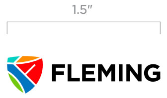
To protect the integrity and clarity of the Fleming logo, the brand lock-up should be no smaller than 1.5” wide.
A lock-up is a visual representation of the Fleming brand and entities associated with the College. These can include schools, departments, initiatives, internal or external partnerships. A lock-up essentially endorses a significant relationship between the Fleming brand and the linked function.
The school logo lock ups can be used to on campus-specific signage, vehicles, and for certain advertising applications.
Examples include lockups for: Haliburton School of Art + Design, and School of Environmental & Natural Resource Sciences.
For approval on applications in question, please email: marketingsupport@flemingcollege.ca

When displayed in conjunction with partner logos, The Fleming logo should be separated from the partner logo with a vertical keyline (with a height equal to the height of the shield), observing the standard clear space rules laid out in Brand Identity Logo Usage.
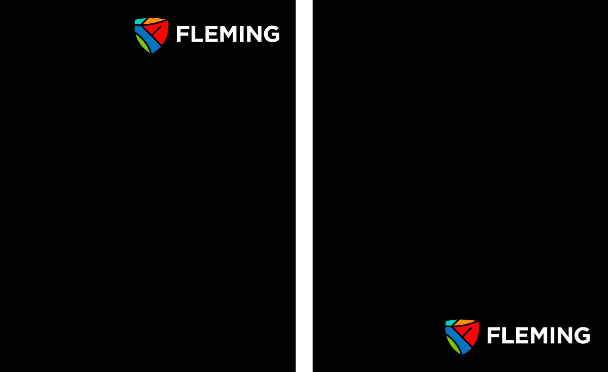
The Fleming logo and colour palette are the primary identifiers and should be used prominently in all communications. Logo should be placed in the top right, or bottom right of a document wherever possible.
The brand lock up should appear primarily on white or black, or a suitably light or dark background.
The logo with white type should be used for dark coloured backgrounds. The logo with Black type should be used for light coloured back/i/one-brand/logo-placement.jpggrounds.
- DO: use the logo on backgrounds that are able to clearly define the logo.

- DO NOT: use the logo on backgrounds where the colour closely resembles one of the colours in the logo.

The consistent application of the Fleming logo is essential to building and maintaining a consistent brand identity. The logo should never be altered or redrawn in any way and only approved digital artwork should be used in documents and on the web. While not an exhaustive list, the examples shown illustrate some incorrect uses and deviations to avoid.
- DO NOT rotate or vertically align the logo

- DO NOT distort logo

- DO NOT change colours of the logo

- DO NOT apply the logo to a colour with insufficient contrast

- DO NOT change the logo configuration

- DO NOT add other elements to the logo (drop shadows, etc.)

The Fleming logo may be used on photography, provided the contrast is sufficient and no part of the logo is obscured. Whenever possible, the Fleming logo should appear unobstructed in the upper-right corner of marketing material.
- DO: use the logo on photography that is able to clearly define the logo.

- DO NOT: use the logo on photography that competes with or obscures the logo.


Black is the primary colour that should be used to maintain a consistent look across all communications.
Primary College Colours
- Fleming Black
HEX: #000000
RGB: 0, 0, 0
CMYK: 40, 40, 40, 100 - Spark Teal
HEX: #00D1C3
RGB: 0, 209, 195
CMYK: 66, 0, 33, 0 - Phoenix Orange
HEX: #FF8C00
RGB: 255, 140, 0
CMYK: 0, 55, 100, 0 - Haliburton Red
HEX: #FF0005
RGB: 255, 0, 5
CMYK: 0, 100, 100, 0
Secondary College Colours
- Eco Green
HEX: #73C810
RGB: 115, 200, 16
CMYK: 58, 0, 100, 0 - Hatchery Blue
HEX: #0075C0
RGB: 0, 117, 192
CMYK: 85, 50, 0, 0
Note: For reference on recommended colour contrast when using type, see the accessibility guidelines.
Typography
Our Typeface Is Gotham
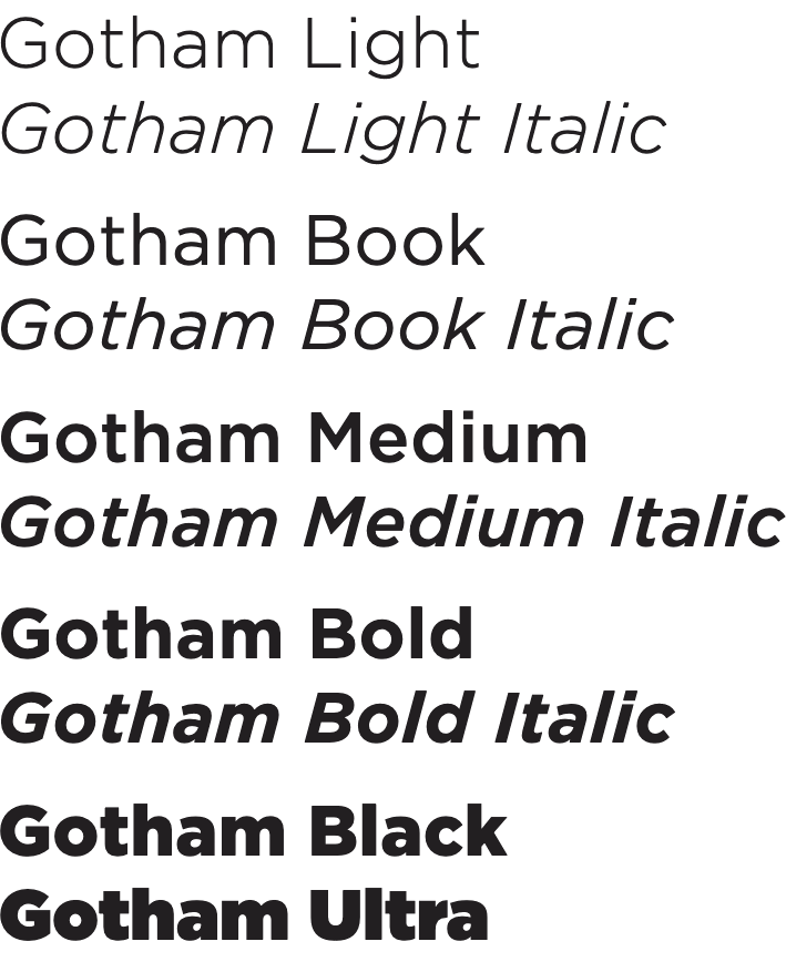
Typography helps to express our messages and establish a unique voice for Fleming. To ensure a consistent look and feel, Gotham is the approved font for use in all corporate, product materials, marketing communications, training and recruitment materials that are printed externally.
To maintain the quality and integrity of Gotham family of fonts, do not alter the shape, proportion or space relationships of any of the characters. Be sure to use the true form of the typeface without stretching or compressing it.
PC and Macintosh versions of the Gotham font family can be used. When Gotham is not available, Montserrat and Calibri may be used.
Note: While our brand font family is officially Gotham, default fonts on normal communications such as email remain the same.
- Type is always black or white.
- Type should be left-aligned for optimal legibility.
- Gotham Bold is used for headlines.
- Gotham Ultra can be used in main headlines for aesthetic purposes.
- Headlines may be in title case or all caps.
- Gotham Narrow Book is used for body copy.
- When Gotham is not available, Montserrat and Calibri may be used.
Photography
Photography is the most effective tool we have to represent our new brand vision to the many audiences we want to engage. Our photography style uses an honest, authentic point of view to convey who we are and what we stand for.

- First and foremost, tells a story
- Features real people in real situations
- Features a student in a dramatically-lit heroic pose with a minimal background
- Utilizes action, activity, and clear context to instantly convey a message
- Shows close-up or detailed shots to highlight projects, materials and hands-on learning
- Uses straight-on angles
- Includes portraits and landscapes (communities, surrounding natural environments, campus locations)
- Incorporates natural light where possible
- Black and white photography may be used
- Photography that appears staged or cliché
- Photography that includes legacy branding, outdated equipment or settings
Microsoft Templates and Email Signature
Explore a range of customizable Microsoft Office templates to help you create engaging, on-brand presentations and documents with ease.
Designed to follow brand standards and meet AODA requirements where applicable, these templates make it easier to create polished, consistent content while streamlining the creative process.
Branded email signature templates are also available for Fleming staff and faculty to use, helping maintain a consistent and professional look across email communications.