Sneak Peek: The Story Behind the New HSAD Calendar Cover
The new Haliburton School of Art + Design (HSAD) course calendar is almost here, and while we can’t show you yet, we took time with the adventurous artist behind this year’s unique cover.
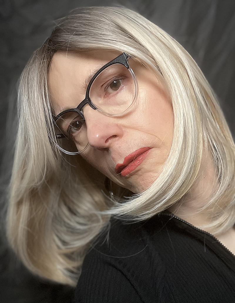
Meet Kat Honey, a long-time Fleming College instructor who has been part of the HSAD team since 2007. She’s giving us a behind-the-scenes look at her art process and the mystery of uncovering layers of paper.
Q. We can’t wait to see the 2026 calendar cover! What sparked your design process?
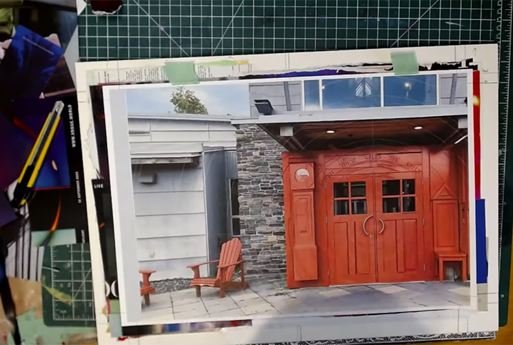
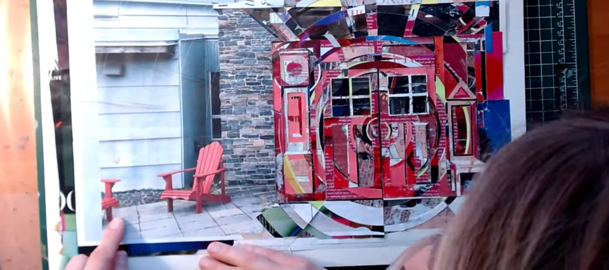
A. I’ve always LOVED Gord Peteran’s red doors at the Haliburton Campus main entrance. They are easily the most iconic symbol for HSAD. The moment I was assigned the project, I knew they would be the subject.
The red doors cover every possible target perfectly. The uniqueness aligns with the School’s nature to further your artistic development. The inscription on the doors, “Within these walls, the walls within disappear.” is brilliant and succinct, yet deeply meaningful. Functional and unified, yet full of interesting visual idiosyncrasies. Like all great art, you can look at the doors thousands of times and keep noticing things you’ve missed before.
Q. You used a unique art medium for the cover called décollage. Can you describe what it is?
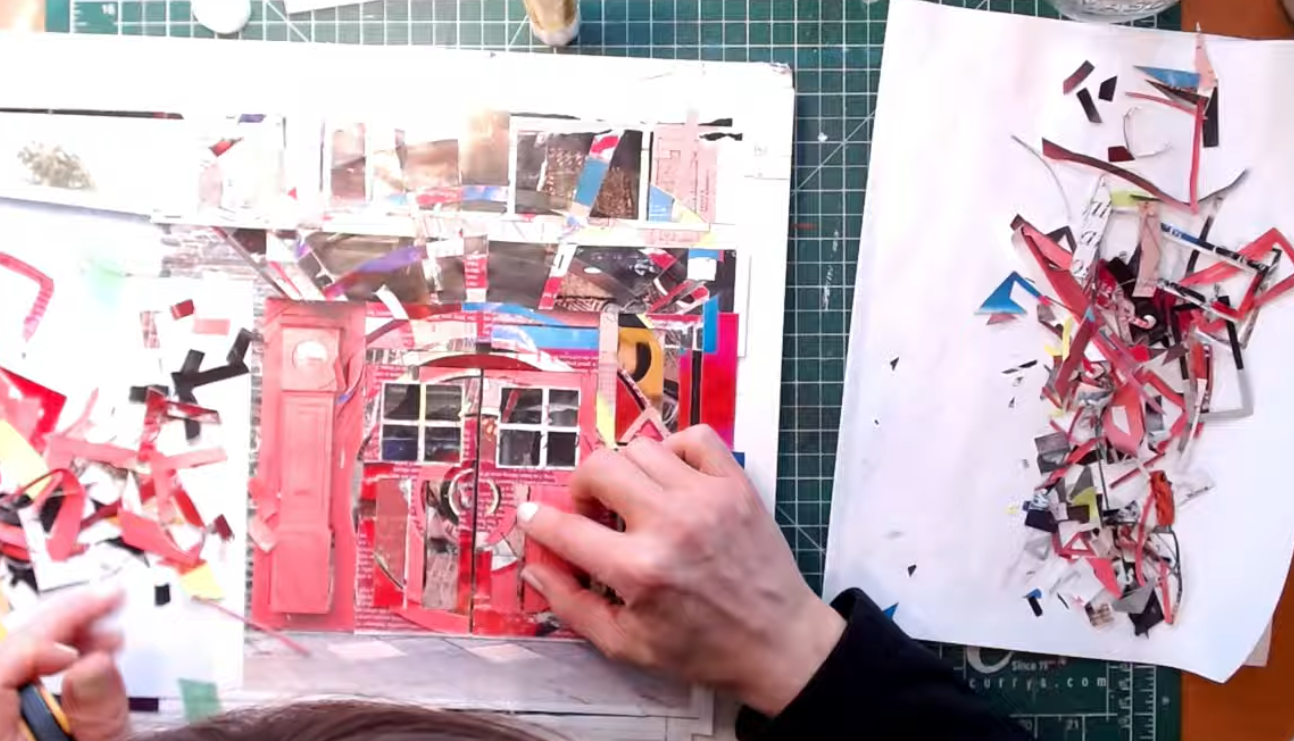
A. Décollage is a form of collage pioneered in 1960s Paris by artists Jaques Villeglé and Raymond Hains, among others. Under cover of night, they’d remove the multi-layered accumulations of posters from walls in the city, taking them back to their studios to peel back parts of the layers to see what interesting combinations they could find between the glimpses of different layers: colours, images, typography.
Q. It sounds a bit like an archeological dig. How did you get into taking up décollage?
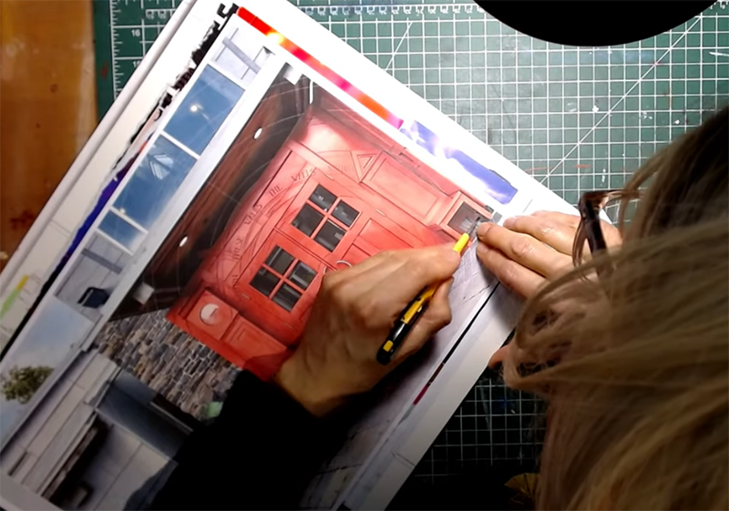
A. I loved the look of décollage and tried it myself on a smaller scale with many layers of magazine pages. I was smitten with the surprises, but the designer in me wanted some control, rather than simply tearing back layers, so I began cutting into the “lasagna” along edges of the top image (e.g., along arms and around hands, facial features, etc.) to create some hard edges that would dictate the shapes of the removed layers. This means you’re essentially “painting” that top scene with the surprises revealed from the layers below.
This is the method I used for the HSAD course calendar cover; I took a photo of the doors and the surrounding architecture and used that as my template, adding and extending both concentric circles and radiant lines from the door design out into the surrounding areas.
Q. In your previous years as a graphic designer you used digital tools, what does the cutting into physical paper allow you to do or express that a computer screen cannot?
A. Digital tools are powerful and versatile, very useful for making and especially editing work. When working with a keyboard and mouse, peering at the screen, even after all these years, it feels divorced from reality. My shoulders clench. My eyes don’t blink enough. My hands and wrists get sore. It leads to a sort of anxious exhaustion. Handling papers, responding to colours, feeling the tactile feedback from my knife and scissors, those are much more in alignment with my humanity. I relax.
I’m also a big fan of limitations. If you give me a project with no limitations, no work will get done. I revel in the fact that things in magazines are the sizes and colours they are. Finding ways to make those work as I find them feel fresh and direct and exciting. Digitally micromanaging every detail feels forced and contrived.
Q. Artists often face project hurdles, what was the biggest challenge you faced with this cover piece?
A. For this piece, the main challenge was simply finding time to work on it during a very busy few months in my life. I seem to recall with this décollage, I wanted there to be a few non-red bits in the doors to animate them, but I had to change a few of those to red after all so the doors would “read” properly.
Q. If one of your students sees this calendar cover and thinks, “I wish I had that level of talent,” what would you say to them?
A. Something that really frustrates me is the myth that artistic talent is inherent, you’ve either got it or you don’t. That it can’t be taught or learned. All creative fields are just like every other field of human endeavour, in that you may find you have a natural interest; however, the vast majority of what makes you better is practice, good education, being unafraid to fail, and perseverance. A mindset of curiosity, attentiveness, and experimentation is also crucial.
We all want it to come easily. It would be so wonderful to just dash off a masterpiece! But in actuality, the reward of earning an accomplishment through dedication is infinitely more satisfying. That’s what truly motivates anyone who’s in it for the long haul; the pursuit, the striving, the questions, the process. Those are the true rewards.
Q. You’re known for creating a learning environment that’s supportive, engaging, and adventurous. What wisdom do you want students or aspiring artists trying décollage to embrace?
A. I think artists trying it for the first time are initially excited by finding things in the buried layers but after that, they begin to grapple with the medium’s creative challenges: What layers to show where? How does what you reveal serve the larger piece? How much serendipity should you allow vs. how much control you should exert? It takes a while to wrap your head around this way of working. Staying curious and open as you work will lead you to the discoveries you need. Widening the range of possibilities increases the chances that students will discover something they love and so want to explore it in more depth.
Q. Art often leaves an impression. When the final cover is revealed, what emotion do you hope to spark in people?
A. First and foremost, for any artist but especially someone new to HSAD, I want people to feel excited about creativity and possibilities. The cover and the school’s doors have significant overlap: they both invite people to look inside. For returning artists, I hope seeing the positive and familiar symbol of the doors, expressed in a new way, will feel like an old friend with something new and inspiring to share. Which is always the case at HSAD!
Q. The HSAD course calendar offers something for everyone. For those inspired by the cover to sign up for a course, what advice do you have for choosing their first one?
A. I suggest choosing something that feels exciting and just a little scary. The scary means it matters, but you fear you can’t quite stretch to it. You can! Learning something truly new is going to make you feel so much more alive and give you a tremendous boost of confidence.
Q. Do you have any last thoughts before we unveil the cover on March 2?
A. I’m so grateful for the opportunity to contribute this cover illustration for HSADs course catalogue. When I was first re-engaging with my personal art practice in the early 2000s, eagerly poring over the HSAD catalogue was like an artist’s candy store: How could I choose just one course?
Whether attending HSAD as a student or teacher, Fleming’s Haliburton Campus has been central to my summers for 20 years now. It’s a beautiful experience. Thank you!
Learn more about Kat Honey at kalhoney.ca.